
Layerpath
Goal: To figure out why Layerpath has a 50% drop off between customers signing up for the product and downloading a free Chrome extension and provide a more intuitive design for their website.
About the project

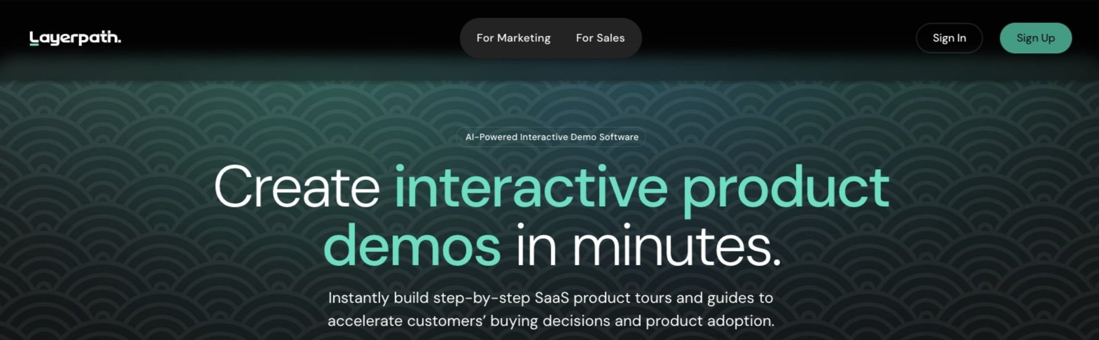
For my first client project and third UX project overall, I worked with a team through the General Assembly UX Boot Camp helping Layerpath, a company that created a SaaS (“Software as a Service”) Google Chrome extension, used for B2B product sales and digital marketing, to create impactful, shareable demos in minutes. Layerpath helps turn these product demo recordings into a polished step-by-step video, to help enhance marketing presentations in minutes.
Layerpath reached out to our team to research and figure out why they had a 50% drop-off in customers signing up for the product and downloading the free Chrome extension. We also realized that we needed to provide an intuitive design for their website.
Team Members:
Richa Kandoi
Savroop Pamma
Kedric Rice
Bradford Schiebel
Time Frame:
3 weeks
Tools:
Figma
FigJam
Google Suite
Maze
Procreate
Pen and Paper
What were my roles in this project?
For this project my roles were the following:
Head Secondary Researcher (Competitive Task Analysis)
Affinity Map Creation
Accessibility Testing for Low-, Mid-, and High-Fidelity Prototypes
Low-Fidelity Designer
Low-Fidelity Prototyper
Mid-Fidelity Designer
Mid-Fidelity Prototyper
Conducted Usability Testing at all stages of the project (Low-, Mid-, and High-Fidelity)
Initial Research
After meeting with our client and discovering that users who signed up for the Chrome extension Layerpath provided to its users, we realized we needed to tackle the problem of users who signed up having a 50% drop-off rate between signing up for Layerpath and downloading the Chrome extension. Then, we discovered that users who downloaded the Chrome extension were not using the extension. Why, do you ask?
We conducted initial usability testing on the Layerpath website to gather some initial data. We learned the following:
2/4 users struggled to download the Chrome extension
0/4 users succeeded in stopping their first demo recording, even with help
0/4 users could edit their demo recording, even with help
Errors: 1/7 misclicks (one link was broken)
Direct success rate: 4/7 finished without help
Other takeaways we had from our initial usability testing included the following:
Reduce onboarding steps for smoother experience.
Implement screen cropping & sensitive data redaction
Restrict demo access to prevent unwanted sharing
"Tour" misunderstood: Replace "tour" with a clearer term
Enhance recording clarity- capture area, highlight clicks & stop button visibility.
Privacy concerns hinder chrome ext. downloads
From here, we completed a competitive task analysis on Layerpath’s competitors:


CTA buttons buried at bottom of home page
Record pop-up appears when ready to create demo recording
10,000 users


No CTA buttons on home page
Record pop-up appears when ready to create demo recording
5,000 users


No CTA buttons on the home page
No record pop-up appears when ready to create demo recording
Users have to click on Layerpath extension icon to complete recording.
568 users
We noticed Arcade, Supademo, and Guidde all had pop-up windows that allowed users to start and stop their demo recording videos with ease. Layerpath, on the other hand, did not.
Other things we noticed included:
In the sign-up process for these competitors, a download of their Chrome extensions was required to sign up
Layerpath did not require a Chrome extension download to sign-up
Privacy was a concern with Layerpath, when it was not with Supademo and Guidde, for example
Stopping a recording with Layerpath required too many clicks, where its competitors did not require as many
Layerpath did not have an accessible privacy policy OR blur tool on its “Edit Tool” workflow
Through these observations, we concluded the following:
Create a design that offers extension download without signup
Need to clearly address security and privacy concerns through a user-friendly policy
Help streamline the demo recording process with fewer clicks
Include a blur feature in the free version for editing recordings
Increase extension visibility on the landing page for easier downloads
Offer more user-friendly signup methods
2 Call-to-action (CTA) buttons available on the home page
Record pop-up appears when ready to create demo recording
40,000 users
User Interview Takeaways
Problem Statement
Following the user interview takeaways, our team realized that the project up to this point required a lot of work. Unlike the Seven Hills Running Shop project when I had to broaden my scope, our team had to shrink the scope. There were so many things our user interviews addressed, but since we had such a tight time constraint, we needed to narrow down the UX scope to address at most 2 key issues in our project, which ended up being efficiency and privacy, which are still 2 relatively broad issues. A problem statement is addressing the problem, however. Based on our data, we decided on the following problem statement.
Product managers need an efficient way to create interactive product demos because manual customization and ensuring data protection are time-consuming, leading to missed opportunities.
“How Might We”, Persona, Prospective Journey Map, User Flow, Site Map
As mentioned earlier, we had a difficult time trying to focus the scope of our project. This section was where our team was really able to narrow in on our design following the construction of the problem statement. We needed to focus our project on the aspects of making Layerpath more efficient and safe for users when creating demo recordings. We created our “How Might We” statements, our persona, a man named Thomas, and his prospective journey to see where our new design would help Layerpath users. Also, based on tree testing we performed to better organize the Layerpath website, we re-organized the website’s navigation to make it as intuitive as possible in the form of a re-organized site map.
How Might We…..
Goals:
Create engaging product demos
Drive excitement among stakeholders
Address technical issues with tools
Increase product adoption
Pain Points:
Technical challenges
Privacy concerns
Feedback delays
Lack of automation
Uncertainty about value
1) Awareness
Touch Points:
Layerpath website
Landing page
2) Consideration
Thinking:
How does Layerpath address security and compliance concerns?
I wonder if I can use my own brandkit.
Touch Points:
Layerpath website
FAQs section
Pain Points:
Difficulty in finding specific information in FAQs
Compliance team approval process
….simplify the process of making interactive product demos reducing the time and effort required for manual customization?
….provide product managers with a user-friendly tool that simplifies the creation of interactive product demos while ensuring data security?
Persona
Traits:
Creative
Empathetic
Thinking:
Is the registration process straightforward and secure?
How do I use this extension?
Touch Points:
Layerpath website registration page
Thomas Miller

Thomas’ Prospective Journey
Scenario: Thomas has a client presentation tomorrow to show his latest feature’s demo.
Thomas has extensive experience in the tech industry, working across different roles from startup to mid size companies.
Thinking:
Is Layerpath suitable for my needs?
How does it compare to other demo tools?
Pain Points:
Limited understanding of Layerpath's capabilities
Concerns about data security and privacy
3) Sign Up
Pain Points:
Technical issues with installing the Chrome extension?
Lengthy registration forms or complicated account setup steps
User flow
4) Create Demo
Thinking:
I appreciate the customization options available.
Concerned about maintaining data privacy and security.
Touch Points:
Demo creation interface
Pain Points:
Ensuring complete avoidance of sensitive data exposure.
Balancing customization with simplicity in the demo creation process.

Site Map
5) Sharing and upgrade
Thinking:
I’m happy this demo is creative and secure.
This is so good that I’m going to look at the subscriptions.
Touch Points:
Subscription upgrade page
Pain Points:
Convincing the client to engage with the shared demo.
Justifying the cost of the subscription to stakeholders.

Interested
Caution
Annoyed
Concerned
Anticipation


Sketches


Low-Fidelity Prototype
Based on our user flow, For this prototype, we updated the Layerpath home page, added 2 CTA (“call-to-action”) based on our research, and a “Redact” tool on our video editing page for users to turn their demo recordings into an engaging video presentation.


The following is the data we collected from the usability testing on the low-fidelity prototypes. It includes the average time to complete the happy path, the number of errors, and the success rate without help:
Average errors: 2/7 misclicks
Average time taken to complete: 9 minutes, 56 seconds
Takeaways:
Make sizing for design edit page more intuitive
Clearly show that the preview page is a video of their demo preview rather than image
Make onboarding clear with labels and instructions for users
Mid-Fidelity Prototpye
After testing the low-fidelity prototype, our team realized privacy concerns were paramount for creating a more engaging product. We needed to create a mid-fidelity prototype with a more intuitive editing page, show the editing page is to edit the video produced for the demo recording, and clearly label our instructions.

Our usability testing on this prototype revealed the following data of our revised “happy path”:
Average time taken to complete each task: 57 seconds
Average misclick rate: 42%
Success rate on each task: 82%
4 / 5 would use Layerpath
Takeaways:
Make it visually clear to the user when the extension has been added to their chrome browser.
Make it usually clear to the user that the recording has begun.
Make it clear to the user that when have to navigate to a different tab to start capturing their steps.
Help show that the clicks are being recorded.
Indicated that the recording has stopped before they get navigated back to the projects page.
Change the dashboard icon and/ or include microcopy ‘dashboard’ too.
Rename the “Privacy Tool” to “Redact Tool”

Loading…..
High-Fidelity Prototype
After receiving additional feedback from the mid-fidelity prototype usability testing, we incorporated the visual cues that our users made note of, including renaming the “Privacy Tool” to “Redact Tool”, indicating that the screen is being recorded, update the dashboard icons to be more intuitive, and visually indicate when the extension has been installed, in the tool bar. Check out our high-fidelity prototype of Layerpath’s website below:
Lastly, we tested our high-fidelity prototype with 3 users to see if our research and design was straightforward for our users. We discovered the following data from our usability testing:
Average time spent on each of the 5 tasks: 21 seconds
Average misclick rate: 26%
Success rate on each task: 97%
Likelihood of usage: 4 . 6 / 5
Ease of usage: 4 . 8 / 5
Takeaways from our testing:
Identified starting point as downloading the extension, indicating clarity in the user flow.
Recognized Layerpath's utility for creating videos, demos, and ensuring data security with AI features.
Valued collaborative capabilities, suggesting options for both collaborative editing and secure sharing for review purposes.
Users liked the clean and tech-oriented design aesthetics.
Recommended incorporating interactive tutorials or pop-ups for feature guidance.
Valued collaborative capabilities, suggesting options for both collaborative editing and secure sharing for review purposes.
After our final round of usability testing, we had mostly positive takeaways. Users responded well to the improvements made to the landing page, the “Redact Tool”, the updated aesthetic, and the ease of use to create a demo recording. As with any project, there is always more work to be done. Users recommended adding collaborative features, interactive tutorials, and clearer guidance through the website. Layerpath themselves were impressed with the updated design.
We included the steps we would take next if we are to return to Layerpath to further improve upon our designs.
Next Steps